

Colour Theory & Mixing
Understanding the nature of pigment, balance, and story in every colour.
Colour theory doesn’t need to be complicated. You don’t need to memorise wheels or charts — just observe how colours behave, how they speak to one another, and how they shift when mixed with water, story, or place.
Watercolour mixing is subtle and alive. It asks for a light touch, a little patience, and a lot of curiosity.

Pigment & Chroma
Every pigment has its own personality. Some are strong and staining, others soft and granulating.
Chroma refers to how pure and vivid a colour is. Earth pigments tend to be lower in chroma — not dull, but grounded. They create hues that feel ancient, harmonious, and natural.
Tip: Our paints are made high in pigment as we do not add any fillers. So a little goes a long way!
Primary Colours (+ Green!)
In watercolour, a simple set of primary colours — red, yellow, and blue — can mix almost any colour. But we’ve found that adding green to the mix early on gives more freedom and life.
Here’s why:
Yellow + Blue = Green, but it's often bright or artificial.
Earthy greens (like moss or olive) can be hard to mix — having one in your palette helps.
Having two versions of each primary — warm and cool (see below)— also expands your range.
Tip: If you’re using ochre, iron red, and ultramarine blue, try adding a sap green or forest green for balance.

Mixing Tips for Watercolour
Start with the lighter colour, then slowly add the darker one.
Test your mixes on scrap paper before committing.
Mix more than you think you’ll need — it’s hard to recreate the same mix again.
Use the tip of your brush to lift pigment, and mix gently — don't mash the bristles.
Avoid overmixing — let swirls of pigment stay visible. That variation brings life.
Tip: Think of mixing like cooking. A little too much of one thing changes the whole flavour.

Complementary Colours (Opposites on the Wheel)
Opposites soften and mute each other. They don’t cancel each other out — they bring balance and earthiness.
Red + Green → muted earthy browns, olive tones, and even black
Blue + Orange → deep greys, warm shadows
Yellow + Purple → soft greens, golden browns
One of the most magical mixes:
Phthalo Green + Crimson Red = a deep, velvety black
It’s rich, organic, and more alive than pure black pigment — perfect for shadows, outlines, or dramatic contrast.
Tip: If a colour feels too bright or artificial, add a dab of its opposite to settle it down.
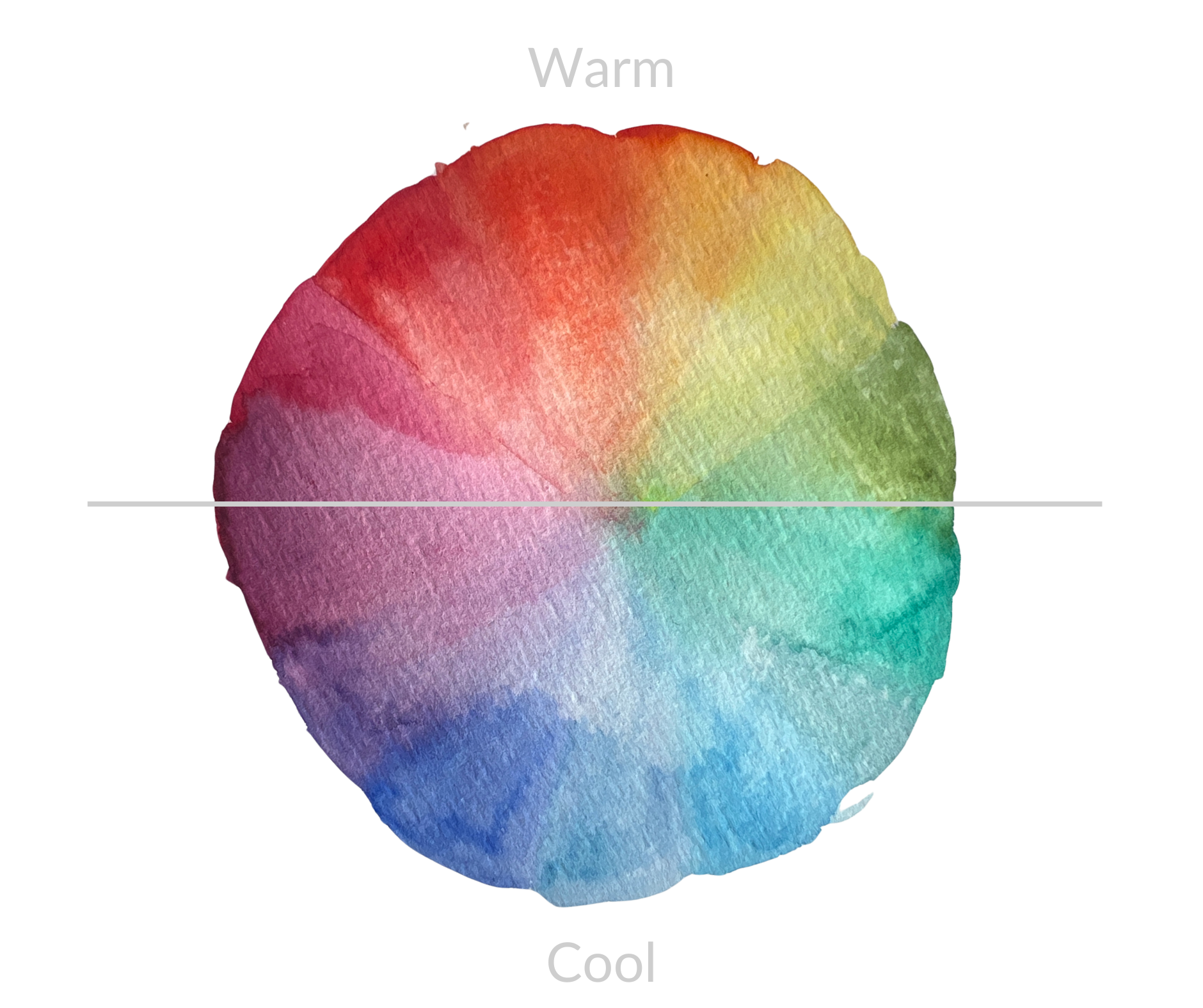
Warm and Cool Colours
Every colour leans a little warm or a little cool — like standing in sunlight (yellow & warm) or in shade (blue & cold).
Learning to feel the temperature of a colour helps you mix with more balance and intention.
Warm colours feel close: red ochre, yellow, burnt orange, brown
Cool colours feel distant: blue, green, violet, charcoal
Even within one hue, there are warm and cool versions:
Warm yellow = golden ochre / Cool yellow = lemon
Warm red = brick / Cool red = crimson
Warm blue = ultramarine / Cool blue = phthalo
You can use this understanding to:
Create depth (cool in the background, warm in the front)
Set mood (cool for calm, warm for energy)
Mix neutrals and shadow tones more naturally
Tip: Mixing a warm and cool version of the same hue can make it feel more alive when placed together (if you paint a fiolage in the shadows with cool greens, add a few specs/leaves of warm green).

Do’s & Don’ts of Colour Mixing (Especially with Watercolour)
✅ DO:
Mix in small amounts and layer up slowly
Let water do the blending
Try mixing directly on the paper (wet-on-wet) for soft transitions
Observe how colours dry — they often look different when wet
❌ DON’T:
Don’t mix too many colours at once — it can create muddy, flat tones
Don’t panic if it looks messy — watercolour takes time to settle, blot out before it dries
Don’t scrub or overwork an area — let it breathe, or let it dry before adding more
Final Thoughts on Colour
Colour mixing in watercolour isn’t about control — it’s about relationship. Listen to what each colour wants to do. Let it mingle, let it shift. What happens on your palette or page might surprise you — and that’s the beauty of it. Learn from it. See colour in nature.
“Mix from place, not perfection. Let the pigments carry the story.”
